In the latest instalment in our series, Nick Taylor, Director, The Design Solution, shows how T Fondaco dei Tedeschi by DFS has blended great design from the 13th century with contemporary vision to create a retail masterpiece.
Venice. The city easily makes it into my top 5 cities on the planet. For me, the most abiding attraction is the atmospheric blend of worn, dilapidated yet solid fabric of catacombs and waterways and the majestic prickles of intricate 15th century Gothic detailing.
The city left a strong impression on me when visiting in my architectural student days, creating deep impressions that led me back there many times since. When I think of Venice, I think about lazy days spent wandering the streets marveling at how the beauty of this place was quite literally around every corner, expressed in its culture, architecture, bridges, and canals, and above all, a spirit of authenticity. Oh, and also the simple pleasure of constantly getting lost and always discovering something new!
Authenticity is something I revere with the upmost respect, especially as a bulwark against what, at times, feels like a tide of fake news, phony facades and an obsession with the skin-deep. OK, I fully accept that Venice has its fair share of dubious souvenir stores and its pizzas are definitely not the best in Italy; but such faults are the unfortunate reality of mass tourism almost anywhere you go. So, when I first heard that Venice has become home to DFS’s most ambitious galleria ever, I was very excited indeed. Retail, luxury goods, architecture, in this fantastic city, delivered by DFS; what could be more exciting? The answer is, the design.
A retail master class
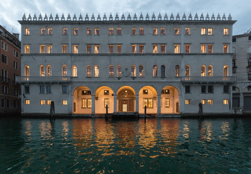
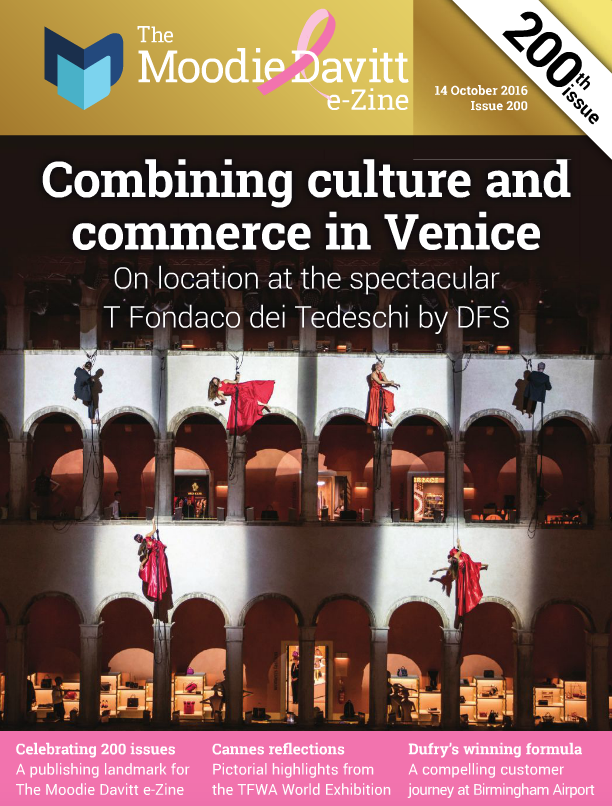
Even a €460 million budget doesn’t guarantee good design but T Fondaco dei Tedeschi by DFS is, without a doubt, a master class in retail design. The building itself is 13th century and sits next to the Rialto Bridge and I think it’s wonderfully appropriate that, from its 1228 construction through to the Napoleonic era, this amazing building was used for centuries as a headquarters for merchants – and now it rises again as a centre of trade.

DFS has revamped its 7,000sq m of space into a luxury department store with the help of architectural practice OMA, led by architect Rem Koolhaas. Officially listed as a ‘monument’, the four-storey pavilion’s interior is utterly contemporary, with its spaces opened up to the public. The addition of a roof terrace, Fondaco’s terrace, reveals a stunning new perspective over the city and gives shoppers a wonderful surprise.
Blending history and style
OMA have clearly paid homage to the building’s fascinating and layered history, having been burned down (twice), rebuilt and re-modelled many times over the last half millennia. The interior architecture has been beautifully handled by the architects, balancing the new interventions with the building’s past, exposing brickwork, maintaining interior archways and introducing terrazzo flooring.
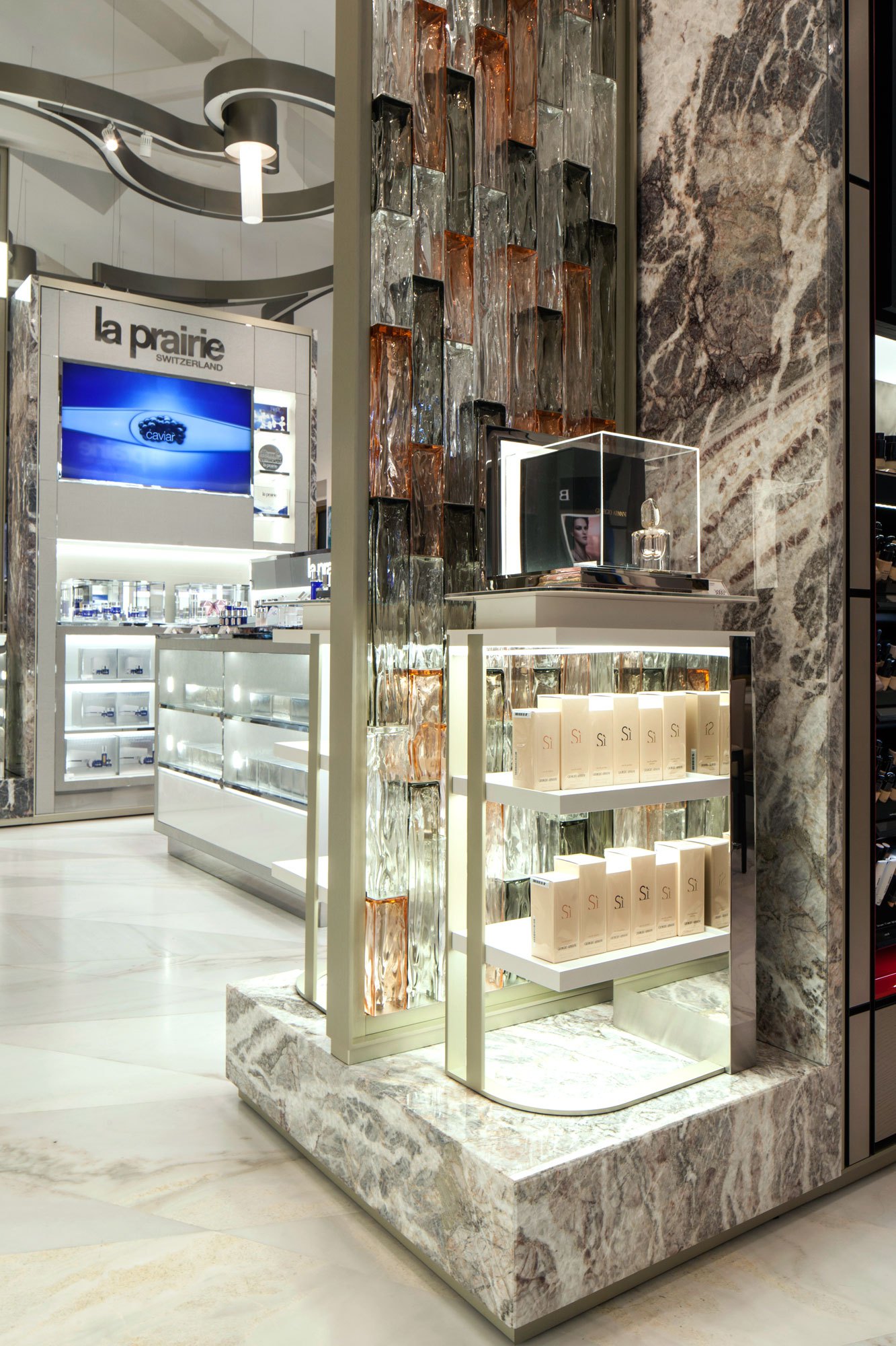
The department store has been described as ‘the Harrods of Venice’, and I certainly think both its offer and presentation is on par with its British counterpart. All the leading luxury brands that you would expect from a LVMH subsidiary are here, and they have been curated into ’three pillars of luxury’ beauty, Fragrances and Well-being; Fashion, Watches, Jewellery and Accessories; and the third pillar consists of Spirits, Wine, Tobacco, Food and Gifts.
[dvgallery id=”156742″ vertical=”no”]
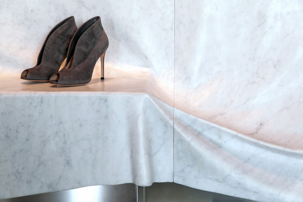
DFS worked with renowned British architect Jamie Forbert to create the retail dream. As retail architects the practice has worked extensively at Selfridges in London and what I particularly like is Jamie’s handling of classic materials, such as marble and bronze, and the quirky unexpected moves – such as the 3-dimensional marble ‘drapes’ that add a theatrical touch in the women’s shoes area. Now that’s a truly expressive sense of place!
Using the interior architecture to brilliant effect, each space is lightweight and airy and is clearly intended to be a voyage of discovery – rather like my student days lost in the alleyways of this amazing city.
This column is the latest in a series – The Designed Experience – a partnership between The Design Solution and The Moodie Davitt Report, to explore trends and influences on airport and travel retail design.
PREVIOUS FEATURES BY THE DESIGN SOLUTION:
The Design Solution: Virtual Reality – Bringing the design experience to life
The Designed Experience: Introducing a new series in partnership with The Design Solution


