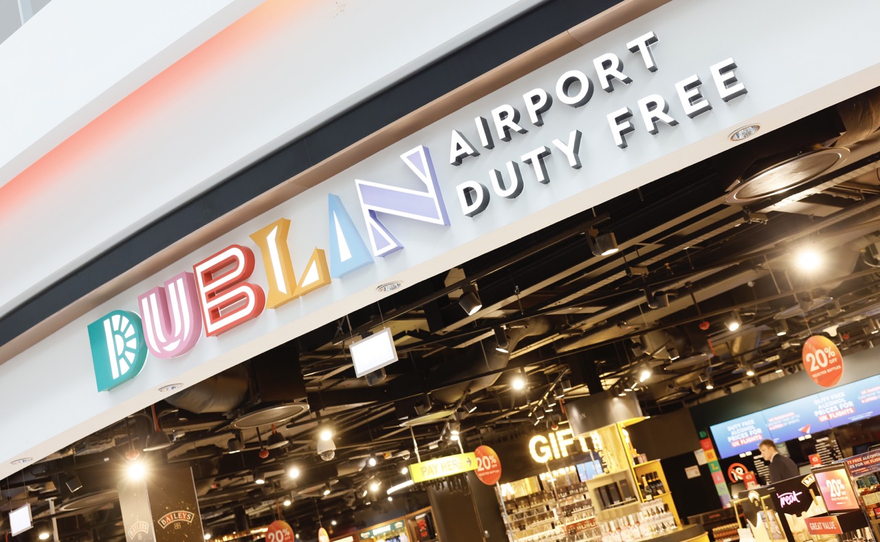
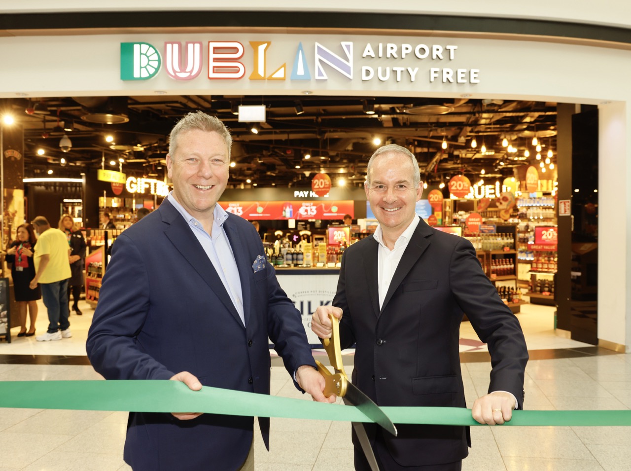
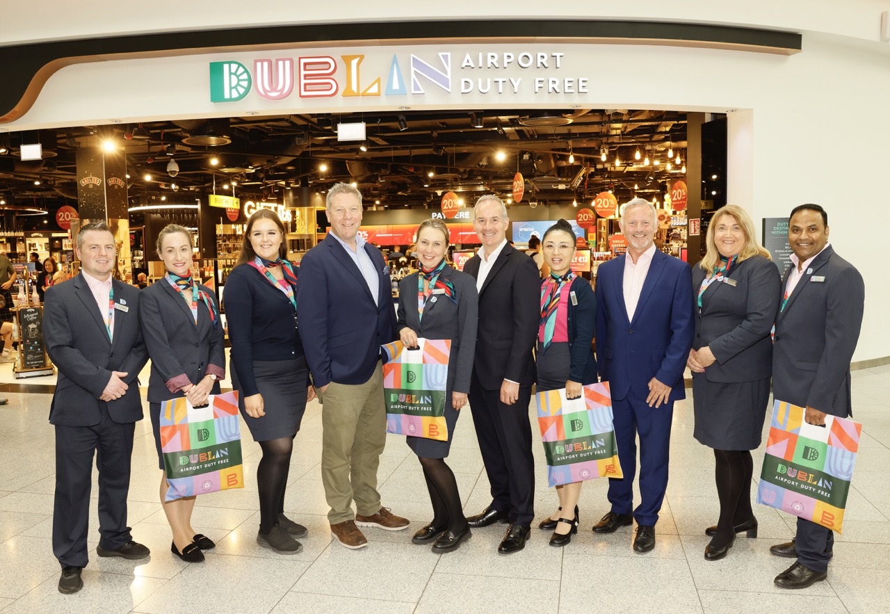
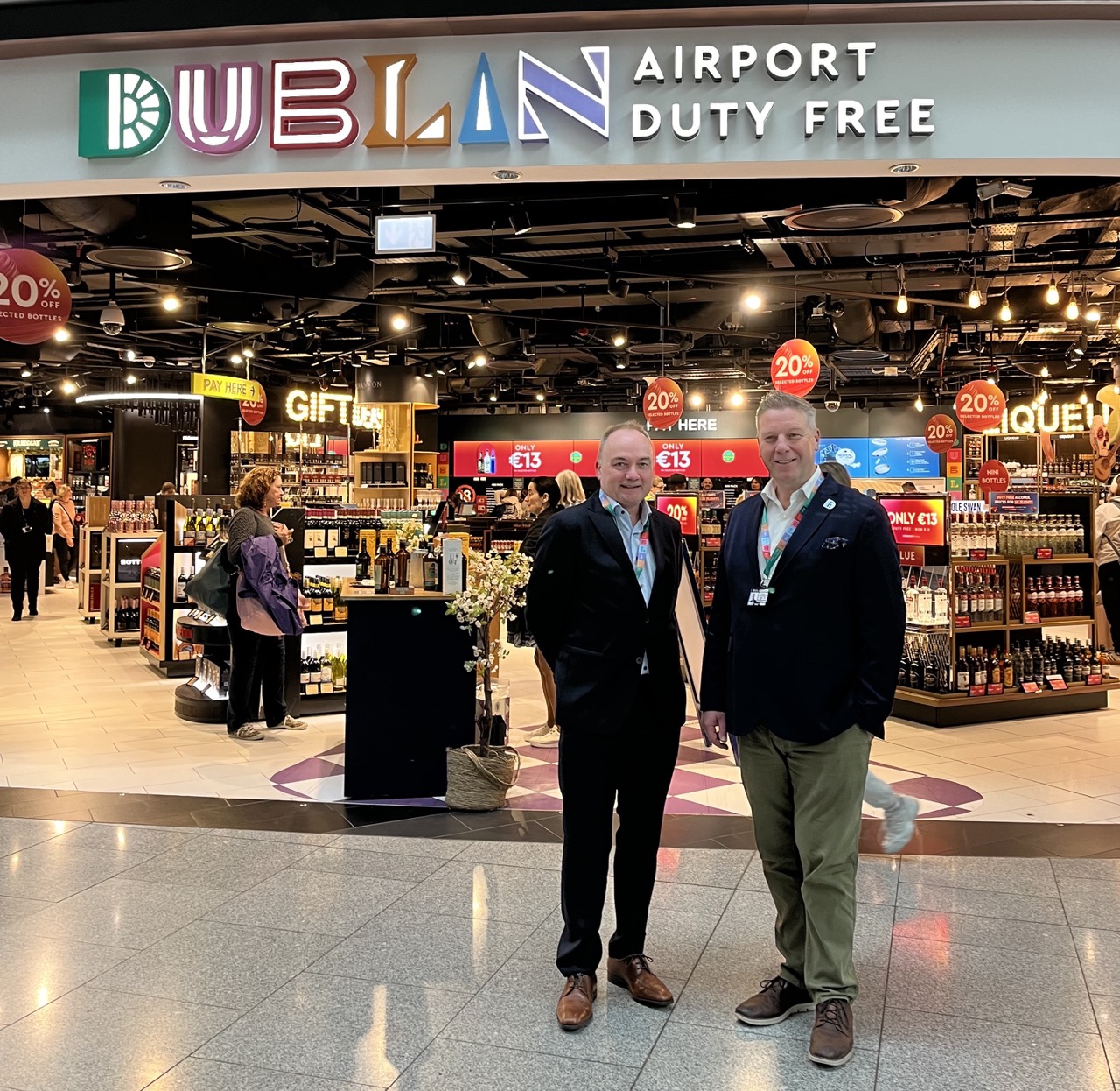
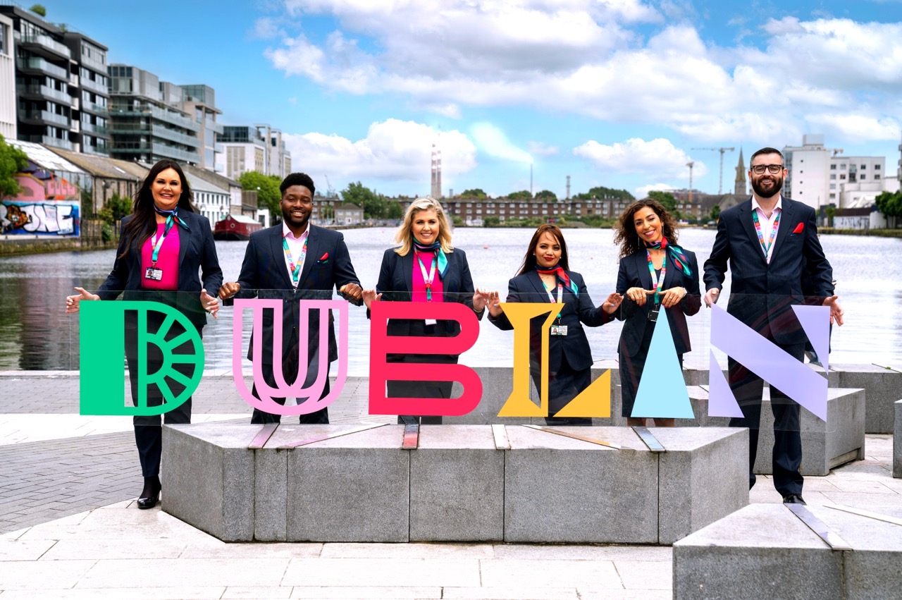
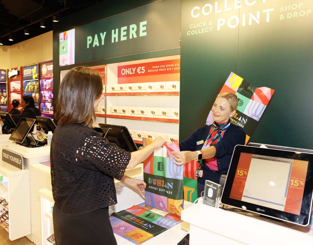
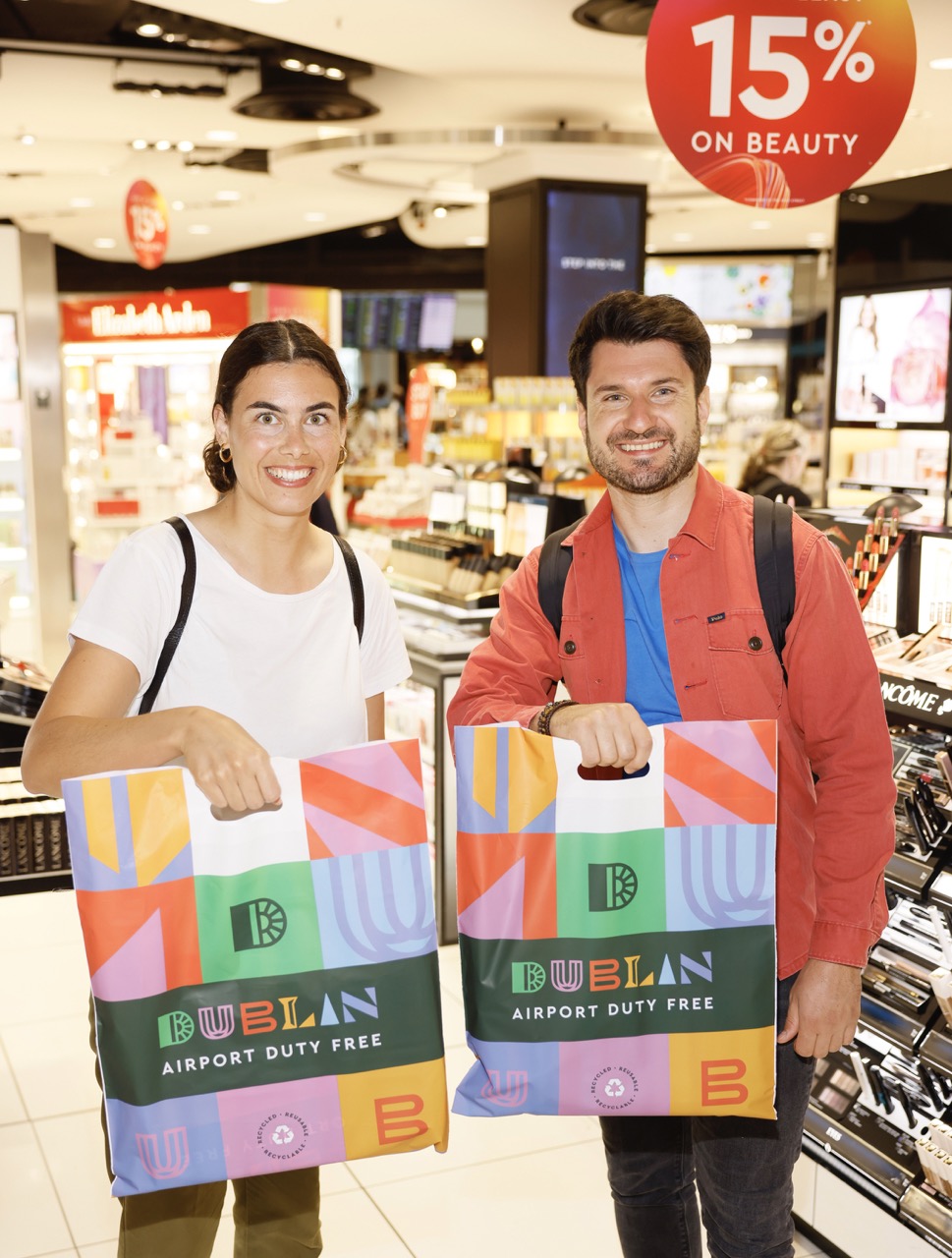
IRELAND. Leading travel retailer ARI has revealed energetic new retail branding for its key Irish airport locations in Dublin and Cork. Dublin Airport Duty Free and Cork Airport Duty Free, each with colourful designs inspired by the heritage and culture cities they represent, replace ‘The Loop’ branding that has been in place since 2009.
The updated brand identities chime with ARI’s focus on sense of place at its stores. The company said the move underlines its “deep commitment to creating authentic, immersive experiences that reflect and celebrate the essence of each location”.
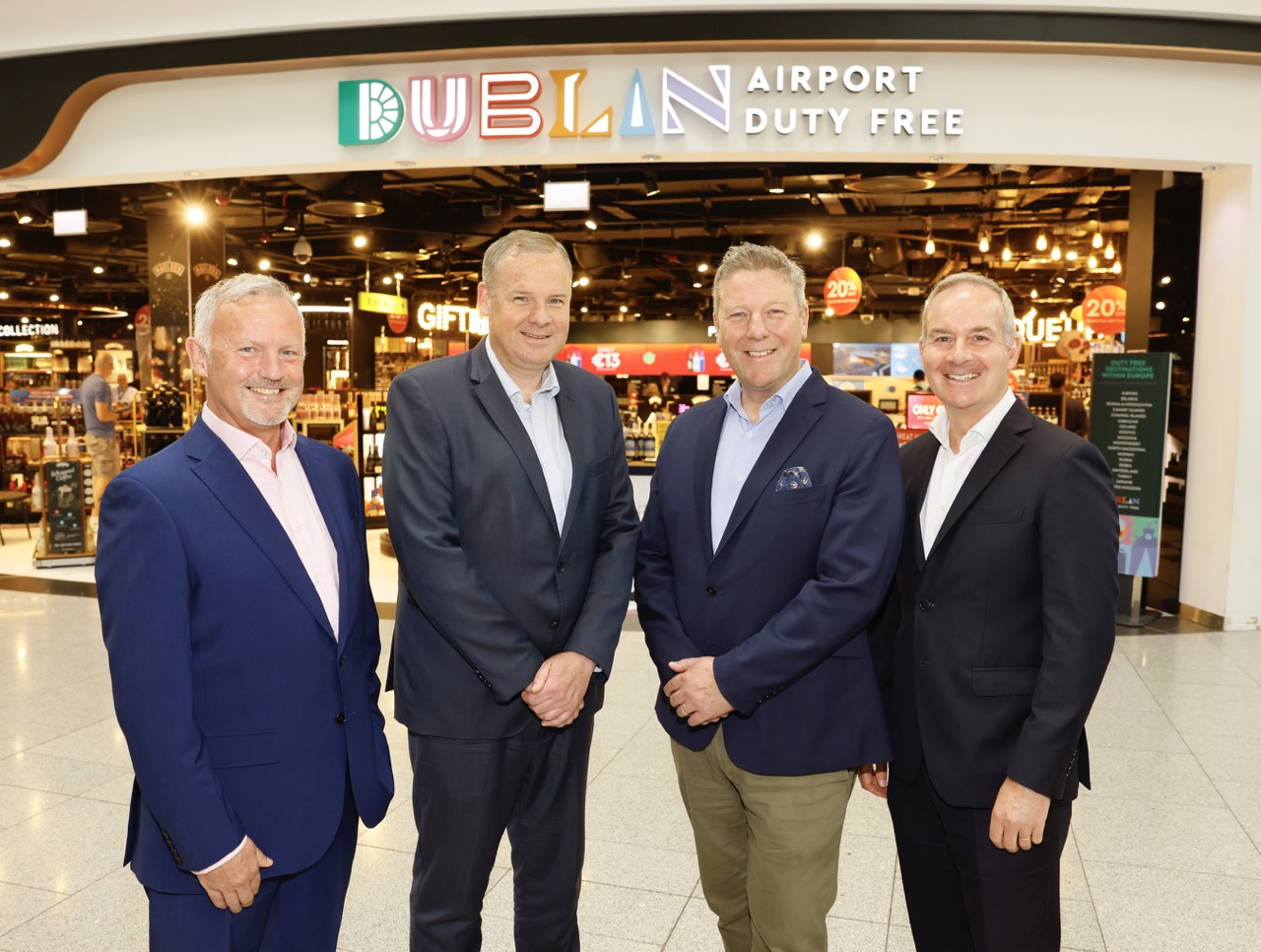
ARI Ireland Retail Director Tom Byrne said: “We are incredibly excited to reveal our new rebrand of our stores at Dublin and Cork Airport.
“We are the first and the last stops for travellers visiting this beautiful country and our goal is to inspire and engage our customers as they visit the duty-free stores on their journey.
“We are uniquely placed to be the showcase of both cities; their old souls and young hearts, representing the heritage and culture, juxtaposed with the vibrancy and modernism of both cities. We want to bring to life the energy and dynamism of our locations, and we do this by reflecting a clear sense of place for each city, for both Dublin and Cork.”
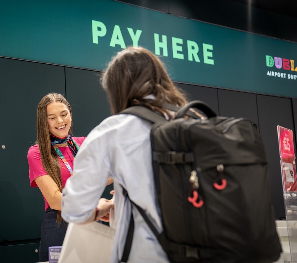
The rebrand has been phasing in over recent weeks across the stores in Dublin and Cork, appearing on the travel retailer’s digital assets across the stores as well as on social media channels and the ecommerce website.
Updated shopping bags carrying the vibrant branding are a particular highlight. ARI has also taken over branding of two airbridges at Cork Airport to mark the launch.
The logos for both locations have been developed to pay homage to the cities themselves, with Dublin’s logo and lettering devised from the Georgian windows of Dublin, the vibrancy of its street art, the literary heritage of the city, the city-centre Spire and architecture such as at the Grand Canal.
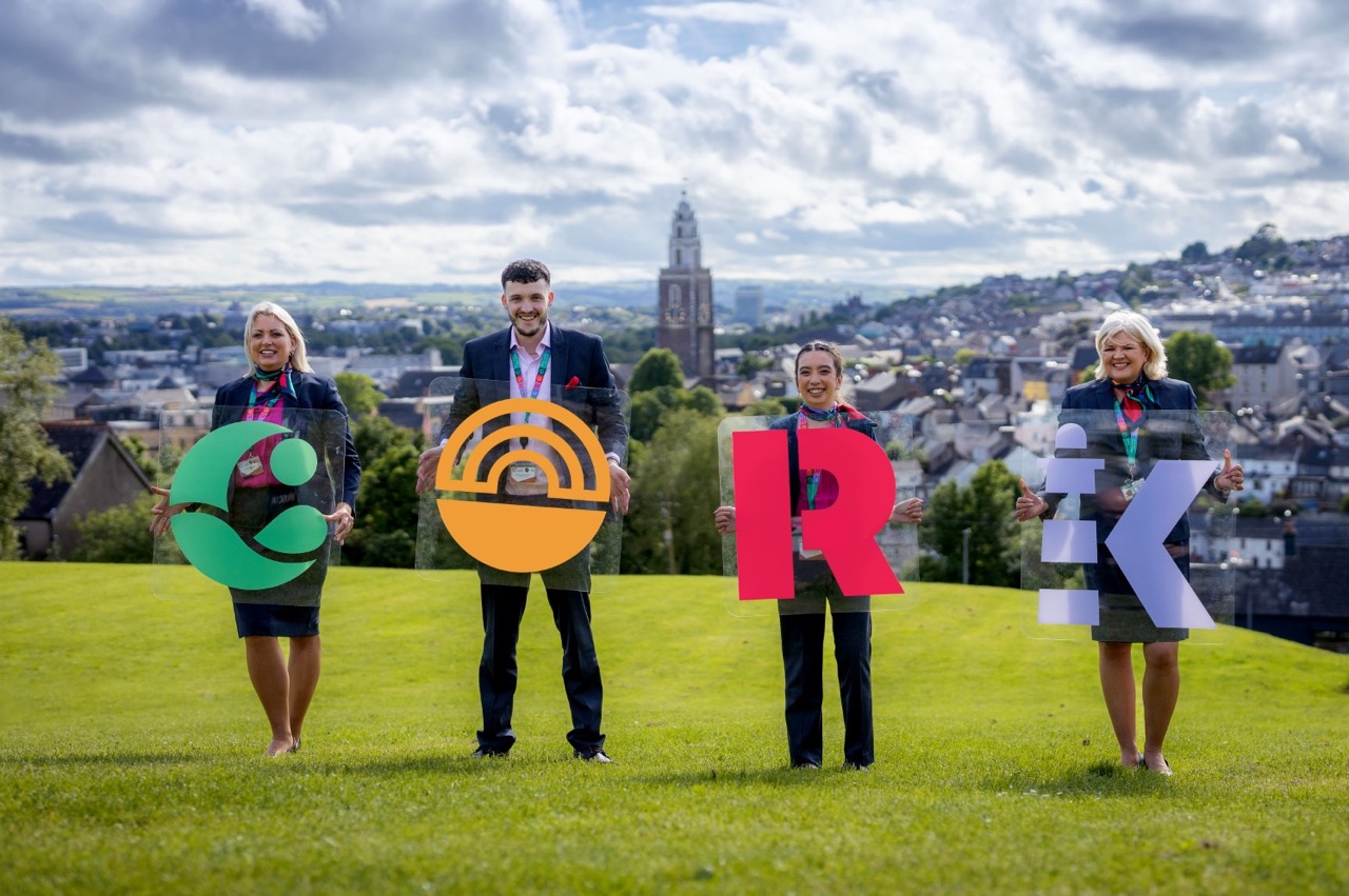
Cork’s logo was fashioned from the River Lee that runs through the city, the renowned English markets – a destination for food enthusiasts in the heart of Cork city – the red colour of the ‘rebel county’ plus the historic Old Head Lighthouse of Kinsale.
Click above for The Moodie Davitt Podcast from Dublin Airport Duty Free
The Moodie Davitt Report had an exclusive preview of the rebranding earlier this month, on a tour of Dublin Airport Terminal 2 led by Byrne.
On the genesis of the updated retail identities, Byrne said: “The Loop served us well both at home and abroad, but it was time for a refresh. We now welcome Dublin Airport and Cork Airport Duty Free.
“We have always emphasised sense of place at ARI, at home and overseas, and this reinforces that message, as well as embracing that sense of ‘Joy on your way’ that ARI stands for. We want travel to be fun. We want to disrupt the journey in a positive, enjoyable way and a vibrant, colourful rebranding achieves that.”
ARI Marketing Director Laura Toner said: “The airports at Dublin and Cork had a role to play in developing this branding. It connects with ARI’s values of being a great partner, being flexible and adaptable, and this helps reinforce each of the airport brands too.
“The stars aligned on the timing in a number of ways. We had the launch of ARI’s new brand identity and expression ‘Joy on your way’ in February last year, we had Tom’s return to lead ARI Ireland in July 2023 – with a vision for what Dublin and Cork Airport Duty Free could represent – and we had new leadership at daa [Kenny Jacobs joined ARI’s parent company as CEO in January 2023] with a keen interest in branding and marketing, and in bringing exciting experiences to the airports. With those dynamics, things moved fast, and travellers now have an enhanced sense that they are in Dublin or Cork and nowhere else.”
Byrne noted that staff have bought into the new branding with enthusiasm, with smart new uniforms mirroring the colours of the rebranding a core element.
“The ‘halo effect’ on colleagues has been powerful. We have a highly engaged team who have been further energised by this rebrand.
“They have embraced the fun and the spirit that we are aiming to communicate. That will flow through into how we engage with passengers, who are at the centre of everything we do.”
ARI said the rebranding is a continuation of its commitment to the vision of being the “world’s favourite airport retailer and partner of choice”, and marries well with its new brand identity and brand expression ‘Joy on your way’, creating a further point of difference for the travel retailer.
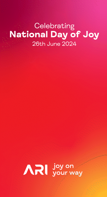
This week sees many celebrations across the ARI estate, marking the National Day of Joy on 26 June – read our related story here.
Over 34 million passengers a year pass through both Dublin and Cork airports. The refreshed offering will bring “a greater alignment of the retail experience with ARI’s enhanced customer value proposition,” said the company.
“This new rebrand of our businesses in Dublin and Cork marks a significant enhancement of our offering, reflecting the heritage of our operations at ARI as pioneers, through a contemporary and modern lens,” said ARI Chief Executive Officer Ray Hernan.
“It builds on our unique heritage spanning over 75 years, showing how we are evolving our proposition for future success. It shows that we are serious about joy and what that means for our customers, and that isn’t just about a logo change; it is an ethos, an intention, an expression of who we are, and a fundamental commitment to elevating the overall customer proposition. Huge congratulations to the Ireland team on their dedication and commitment to delivering this transformative offering, which will no doubt excite and bring joy to our customers for years to come.”
The logos for both locations have been developed with each letter paying homage to the cities themselves:
Dublin:
D – historical Georgian doorways at Merrion Square
U – vibrant umbrella street installation at South Anne Street
B – Dublin’s famous literary heritage depicted by a stack of books
L – statues of Dublin city such as Daniel O’Connell or Molly Malone
I – the famous Spire of Dublin on O’Connell Street
N – modern architecture in the city such as at the Grand Canal
Cork:
C – River Lee running through Cork city
O – Cork’s famous English Market, trading since 1788
R – The Rebel County – Cork’s moniker since the War of Independence
K – the Old Head Lighthouse of Kinsale ✈