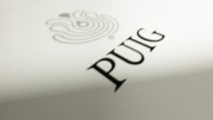
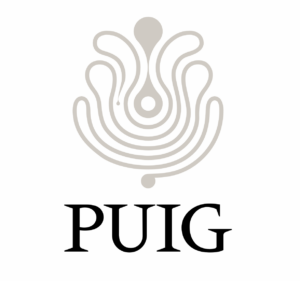
Family-owned Spanish fragrance house Puig has revealed a new company logo that pays tribute both to its 110-year history and its bright future.
The logo will be launched for the first time during the bell-ringing ceremony of the Barcelona Stock Exchange on 3 May. It will then be implemented progressively.
Reflecting Puig’s core values by placing creativity at the centre, the logo was created in partnership with French art and design agency M/M Paris. It builds on the original design of Swiss designer Yves Zimmerman, featuring a bespoke typeface called Parelelo that reinterprets the original font, Méridien, created in 1955 by Adrian Frutiger and Zimmerman.
Notably, the refreshed logo features a new symbol which presents an infinite line of creativity inspired by a painting from Spanish painter Joan Miró.
Puig Chairman and CEO Marc Puig commented: “At this transformational moment for Puig, we wanted to reinforce who we are, what we do and what we stand for: a home of creativity. We are connecting our long history with our commitment to innovation, our discretion with our sensitivity as a nurturing place where brands can shine, people can grow and daring ideas are celebrated.” ✈


