 |
INTERNATIONAL. The Nuance Group today unveiled its new branding and corporate identity, which is designed to reflect the company’s global presence as well as its multi-regional differences.
Unveiling the new look, The Nuance Group President & CEO Roberto Graziani said: “Our new corporate identity captures the very essence of what we are, what we stand for and how we want to be seen.
“To be a truly global brand, we need one voice, one look and a consistent way of doing things with, clearly, the necessary local adaptation. We want to be a global brand with a local touch. And, we want to be at the heart of every journey creating excitement for our customers and long lasting partnerships with our stakeholders.”
 |
The new identity comes in different colours for different regions |
The Nuance vision is “˜To lead through partnership and retail excellence’. Together with its partners, the company said it is delivering exciting retail environments to travellers around the globe.
The company commented: “In an ever-changing world, Nuance is developing its business, building strong, lasting partnerships and creating innovative, industry leading retail experiences.
 |  |
Out with the old, in with the new | |
 |
“To be a truly global brand, we need one voice, one look and a consistent way of doing things with, clearly, the necessary local adaptation“ |
Roberto Graziani President & CEO The Nuance Group |
“˜To be at the heart of every journey’ is the defining thought at the very core of the Nuance operations. The company creates a sense of excitement and anticipation for passengers when they travel throughout the airport.
“Nuance stores are destinations that customers look out for and return to. Nuance wants to be an indispensable part of the customer’s journey, the essential stop, they have to make.”
“Developing our brand was a very interesting and exciting journey,” Graziani said. “Together with our agency, Designhouse, we developed the visual identity and the brand strategy. Furthermore, during the development process we involved all company’s stakeholders.
“We interviewed our airport and brand partners who gave us valuable advice on how to further develop our cooperation with them.
“We also organised corporate identity workshops on four continents to engage our employees, who generated excellent ideas on how to bring our new brand and corporate identity to life.”
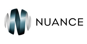
The new Nuance logo is formed from a dynamic ribbon shaping a globe, at the centre of which is the initial “˜N’ of the company’s original logo. The ribbon represents a retail journey, which, in forming a sphere, depicts the global nature of Nuance’s retail business.
As a global company, Nuance said it wanted to retain a local touch wherever it operates. Under the corporate global umbrella, unique colours have been assigned for each region, demonstrating the importance of local adaptations: blue for Americas, gold for Asia, okra for Australia and green for EMEA.


