 |
 |
The menu stays planted on the left-hand side throughout and is concise in its function. It enables the user to browse the website without losing their way |
Website of the week: DFS Galleria
The world’s most powerful travel retailer owns both airport and off-airport stores aimed at attracting the international traveller. There are nine large DFS Galleria shopping meccas around the globe and smaller Gallerias in several locations.
STYLE
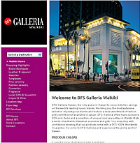
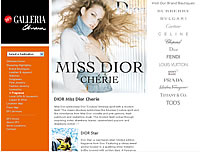
DFS Galleria certainly knows a thing or two about style – just take a look at any one of its upmarket stores across the globe. And this is reflected in the company’s array of websites which have an impressive, modern and sophisticated layout without being threatening or over-the-top.
Consistent to all 13 of the retailer’s websites, the layout is an appealing one; it is easy on the eye (thanks to its good balance of colour, stunning visuals of the outlets themselves and attractively illustrated products), orderly (neat left-hand side menu and tasteful representation of the brands carried) and unfussy (it is glamorous yet simple).
As well as being consistent across all DFS websites, there is a consistency within each website too – the DFS Galleria logo stays in one place throughout every webpage, as does the left-hand side menu. Regularity indicates methodical planning. In terms of presentation, DFS Galleria’s websites pass with flying colours.
USABILITY
The web term usability refers to how easy it is for a user to navigate around a website. In this area, too, the DFS Galleria website shines. Navigation is clear and easy, and even if (miraculously) one were to find oneself dazed and confused, the DFS Galleria logo sits stubbornly in the top left-hand side corner of every page as a link to the homepage. Although regarded a universal standard today, it is worth praising in the hope that more travel retail websites will follow suit.
The menu, too, remains planted on the left-hand side throughout and is concise in its function. It enables the user to browse the website without losing their way. As a result, users do not find themselves digging for the information that the website holds; it is laid out in front of them in an accessible fashion. The menu consists of:
– A drop-down menu offering the choice of destination for 13 DFS Galleria outlets.
– Shopping highlights which comprises the various product categories (Leather & apparel, Liquor & wine and so on). This list varies according to location.
Other options on the menu include Location Map, Floor Map, DFS services, DFS Home, About DFS, Store Locations and Contact.
As a result, the website appeals in its straightforward approach to conveying its message – there are no long introductions of Flash animation which tell the user nothing about what the site entails. It is short, simple and straight to the point.
 |
To celebrate the launch of our new Travel Retail Web-Wide Index, each week we put the spotlight on one of the growing array of dedicated travel retail websites or web sections. Click here or on the image to read the index. |
Available on the right-hand side of the homepage are several big buttons highlighting What’s new, Promotions & events and Find Our Store which are common to all DFS Galleria sites. Each destination then may have its own individual gimmick such as DFS Okinawa: The Video or Give Luxury (Hong Kong).
Another advantage this website has over much of the competition is the speed at which pages load. The DFS Galleria website has fast-loading, light pages which don’t take more than a few seconds to upload – a crucial element in busy consumer’s lives.
FLAWS
Amid this hive of web activity, however, exists an empty space – the fact that the website (and this applies to all branches) has no product pricing facility. The travel retail industry seems in limbo over the decision to list prices online. But if DFS wants to stay loyal to its mission of serving the international traveller, then providing that traveller with the option to plan their shopping in advance is surely essential?
Another product-related flaw is that, despite presenting the available brands and showcasing several of the items, a travelling shopper who logs on in search of a specific product will not be able to find out whether this product is available at the outlet. There isn’t a facility which lists all products stocked at each location. The website is therefore limited in its product display, as each category demonstrates only four items, which is a shame as each item is tastefully illustrated and given a concise description. This narrow display would be acceptable if the consumer had the option to check the availability of goods carried at the outlet before making the journey. This is a crucial point to consider for an off-airport store, because the consumer has to go out of their way to get to it; they’re not just killing time before a flight.
DFS Galleria’s website is a trailblazer in terms of the quality of its brand presentation. It is effortlessly classy in its simple elegance. However, just as the old adage warns “˜Don’t judge a book by its cover’, so it can be applied to websites. DFS Galleria has a good deal of substance, but is lacking in several key elements which do matter to the travelling international consumer. But it is nevertheless encouraging to see a retailer take so much pride in its website – and this will hopefully set the trend for more of its kind.
What we like about DFS Galleria’s website:
Tasteful, eye-catching presentation and layout
Efficient navigation system
Fast page loads
What we think could be improved/added:
Add product pricing
Include a list of all products stocked (images preferable but not essential)
Visit www.dfsgalleria.com
MORE WEBSITES OF THE WEEK
Website of the week: Cochin Duty Free – 08/12/05
Website of the Week: Frankfurt Airport – 30/11/05
Website of the week: The Tappoo Group of Companies – 24/11/05