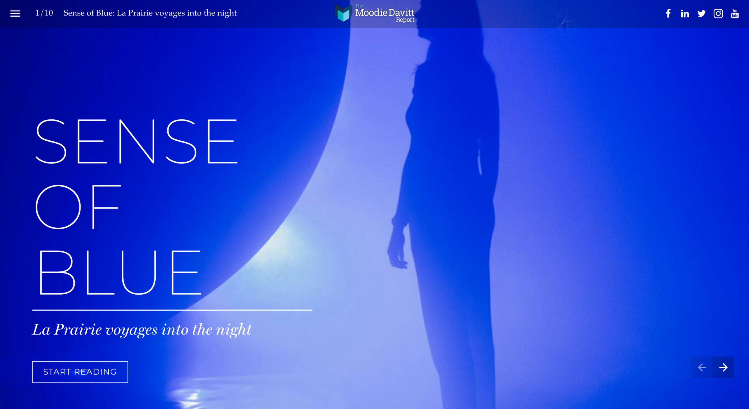


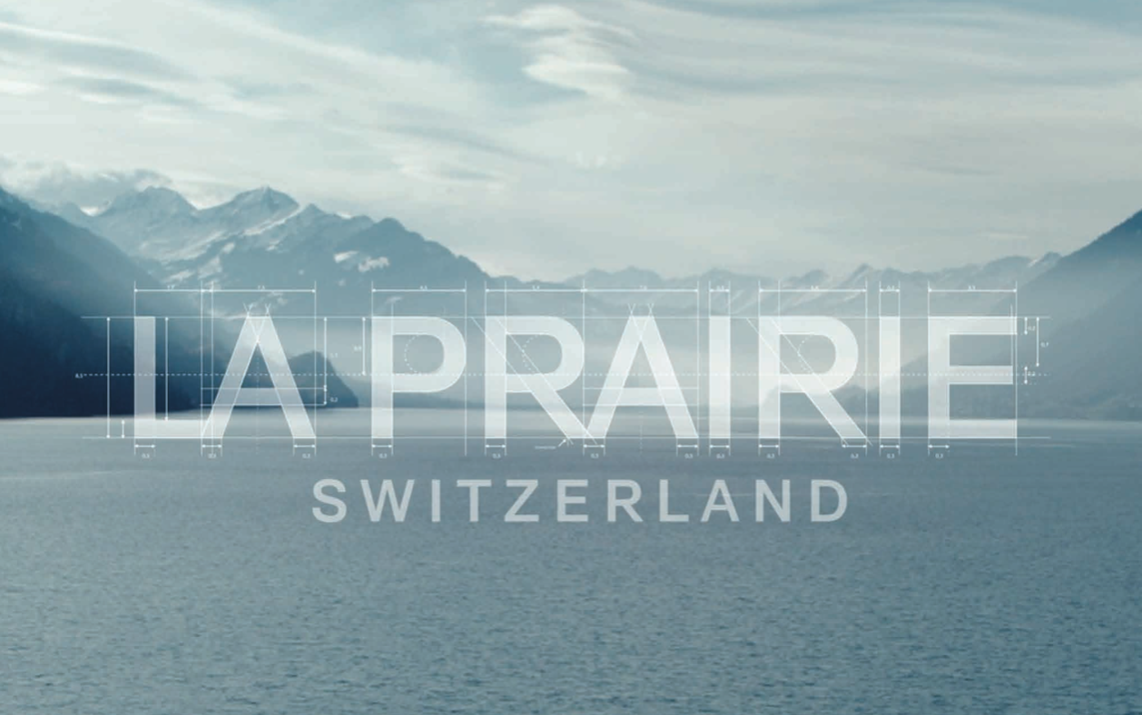
For the first time in almost 50 years, luxury skincare house La Prairie has unveiled a new logo and brand identity. The reimagined logo takes inspiration from the house’s Swiss heritage.
It is accompanied by a refreshed graphical identity and communication campaign with the theme ‘Hold Time in Your Hands’ which will be premiered worldwide on 25 January.
“Our logo is the reflection of La Prairie’s soul,” commented Chief Marketing Officer Greg Prodromides. “It embraces the values and the heritage of the house; it expresses its singular identity to the world. It represents who we are, and who we will be tomorrow.
“Naturally, as the world and our house evolve, we felt it was the right time to re-imagine our logo. Untouched for almost 50 years, this new logo represents a key milestone in the story of our brand. It is a way for us to celebrate our past, while continuously looking at our future ahead.”
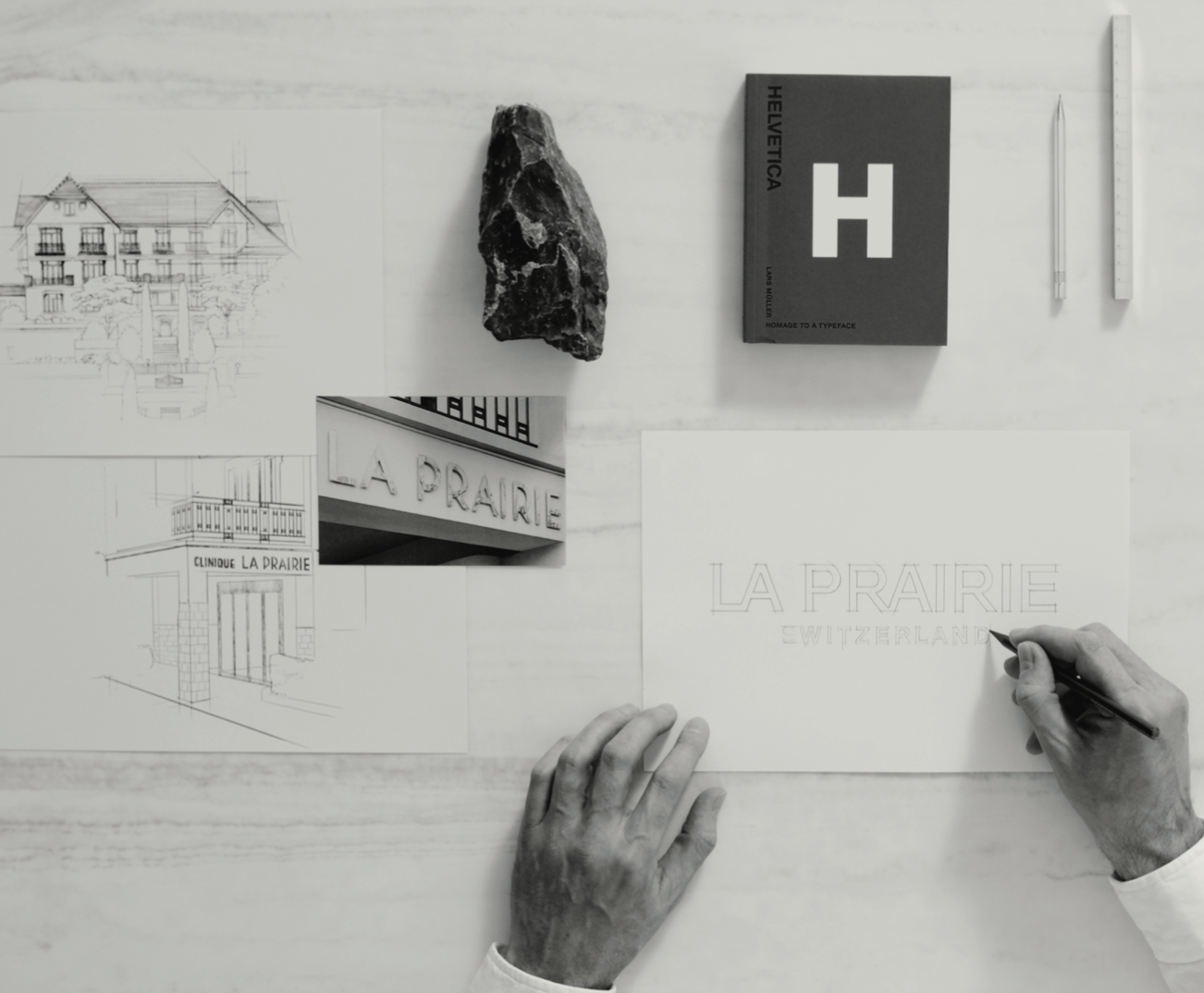
The new La Prairie logo was inspired by the first-ever visual identity of the Clinique La Prairie in the 1930s. Featuring an elegant design in streamlined capital letters, the Montreux clinic’s signage was designed using Art Deco elements which was the major design movement of the period.
In the 1970s, La Prairie’s best-known logo was designed with the Helvetica font (today called Helvetica Neue), created by typeface designer Max Miedinger in Zürich. The font was a symbol of simple, modern Swiss design.
The new, refreshed logo offers a sharper, contemporary take on Helvetica which takes the logo from lower case to upper case. It is accompanied by a new signature seal and will be rolled out across all La Prairie products in the coming months.